KATE SPADE CHOOSE YOUR LOOK
The Choose Your Look Smartwatch app magically makes the dial of your watch display match the outfite you have on. This flagship app was specifically designed for the Kate Spade Scallop touchscreen watch, which was nominated for Engadget’s Best CES 2018 People’s Choice Award.
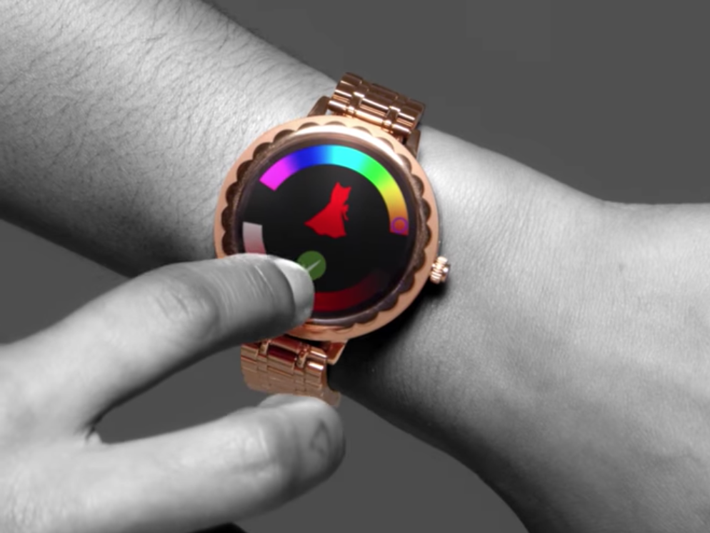
A very cool and easy way to customize the look of the watch without requiring the user to spend countless minutes changing the look and behavior of the wearable.
9 to 5 GoogleDESIGN PROCESS
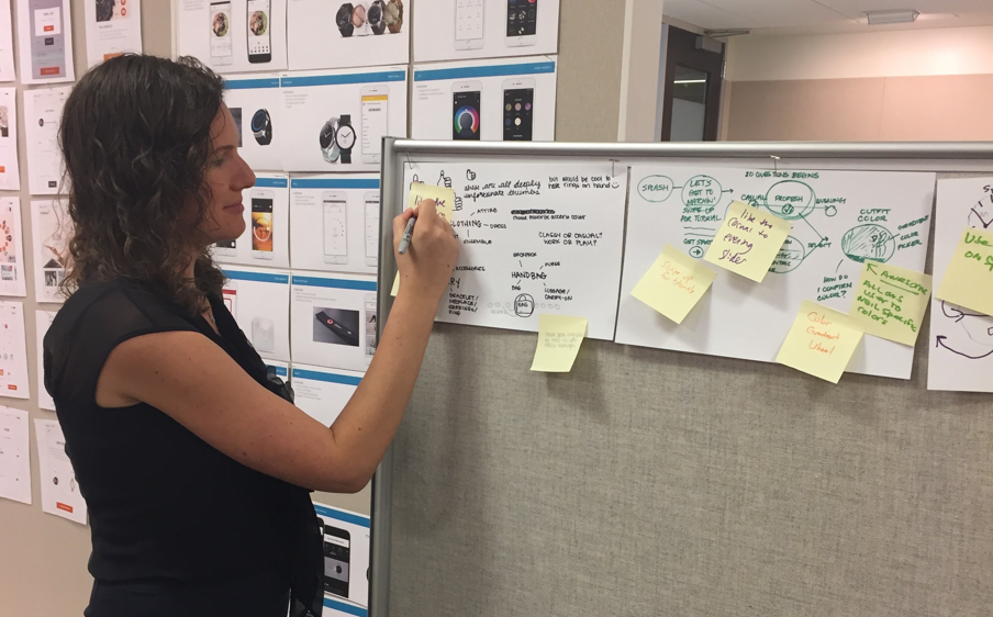
I kicked off this project with a brainstorm session with a diverse group of peers from different professional capacities. We made quick thumbnail sketches of original concepts and used post it notes to highlight the most creative and viable solutions.
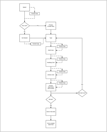
The initial flow was a linear concept of the process of gathering input for a watch-style algorithm. We ultimately decided to change this flow to allow the user freedom of sequence by the ability to select an attribute from a main menu.
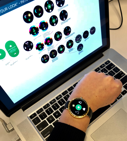
We created a rapid prototype in Invision to test the functionality of our concept with users, using an Android watch frame for context.
We documented the happy path flow of a user as they make their selections. This helped to gain alignment on the product team and communicate the direction to external stakeholders.
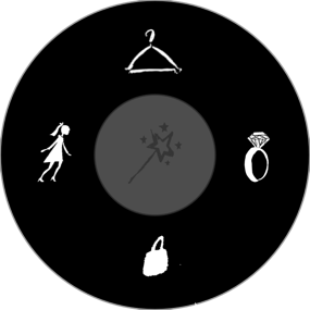


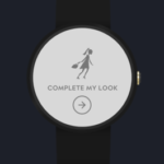
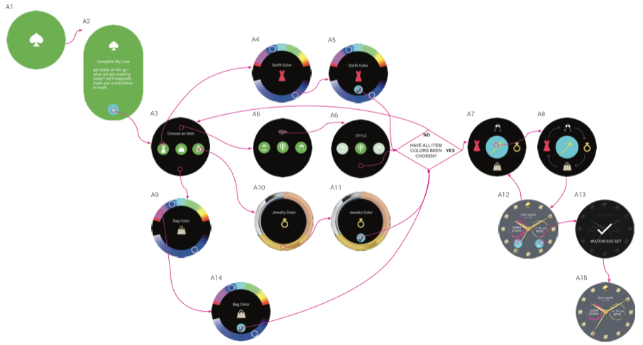
I initially incorporated the style guidelines from the Kate Spade mobile app for hybrid watches, including colors and illustration style. In this example, the left is the empty state, and the right illustrates the entered state when the user has made all selections. I used arrows to illustrate the circular animation that occurs when the user taps the center “magic wand” that generates the watch style. I used Adobe After Effects to create the animation to communicate the timing and movement to the developer.
I initially incorporated the style guidelines from the Kate Spade mobile app for hybrid watches, including colors and illustration style. In this example, the left is the empty state, and the right illustrates the entered state when the user has made all selections. I used arrows to illustrate the circular animation that occurs when the user taps the center “magic wand” that generates the watch style. I used Adobe After Effects to create the animation to communicate the timing and movement to the developer.
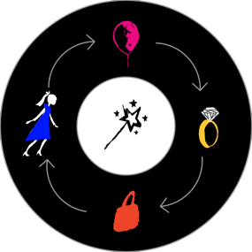
An animated onboarding interstitial points out what icons users need to tap on if they are inactive for more than 4 seconds. This was never used due to scope limitations.
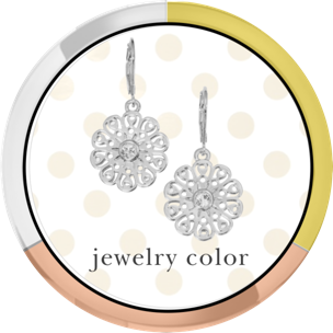
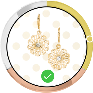
One of our UI options was a photo-real example from the brand’s current collection- in greyscale on the left and in the selected metal color on the right.
The final prototype incorporated brand new icon illustrations and cleaner transition animations.