FROST BANK HOME LOANS
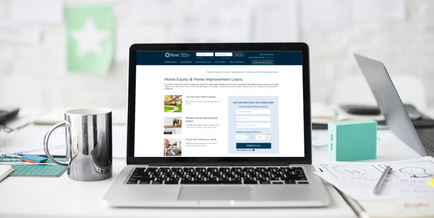
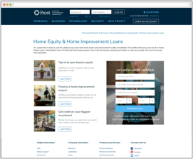
The Home Loans section of Frostbank.com focuses on educating customers on the various home loan products the bank offers as well generating new lending leads. Customer-focused titles attract users to the loan type that applies to them, with the option to discover more details with clear calls to action. A lead generation form allows customers to take action to initiate the process of applying for a loan immediately.
Role
Lead Designer
Platform
Responsive Web
Date
March 2018
We don’t have to wait for our customers to call. We can call them with an idea of what they already want, so we can come prepared.
Telephone Banking Manager, Frost BankDESIGN PROCESS
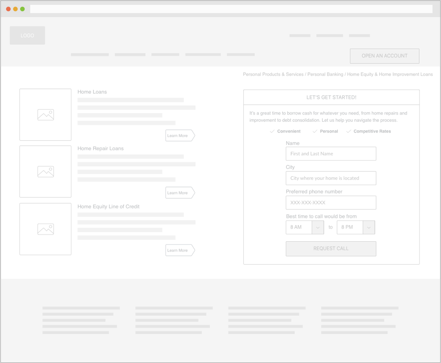
I identified the target market and conducted user interviews to develop personas. I also interviewed internal stakeholders to create story maps and key business goals. I then tested several hand drawn thumbnails, and used the feedback from those to create a digital wireframe. This digital wireframe outlines visual and typographic hierarchy for the home loans main page, organizing the interface with clear priorities for user interaction.
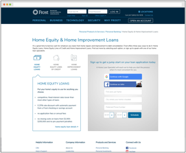
Following the digital wireframe, I created three user interface options. The first was styled after existing styles on the website. The second is a more minimalistic approach, while the third is a more contemporary style. I gathered user feedback to combine the best elements of each option together for further refinement.
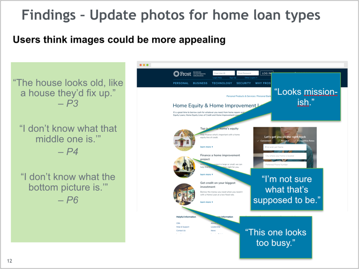
With the second iteration or designs, I gathered further feedback and created a deliverable highlighting the most significant findings.
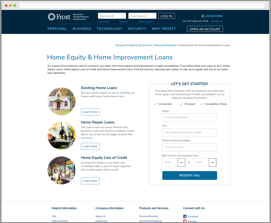
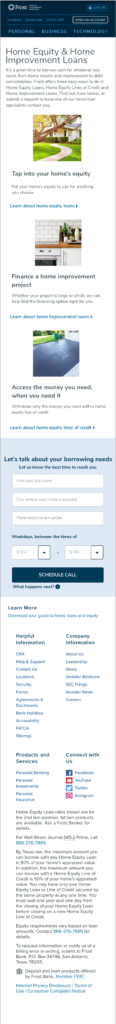
Based on the feedback, I decided to change the imagery to better communicate the differences between each loan type. When a stakeholder was hesitant to make the changes due to opinion, I conducted further user testing with online participants for design validation. The results eased their reservations about changing the images.
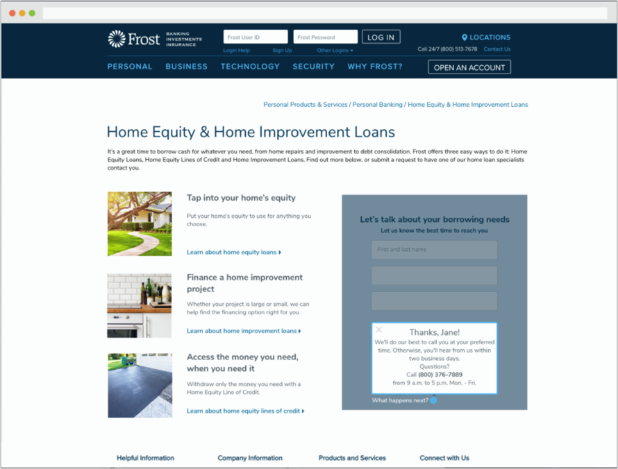
As the site was in development, the internal marketing department requested to update the images to better attract underserved markets as well as reflect the optimistic direction the brand is headed in. I worked with a partner agency to select the new assets used currently. I also worked with the development team and product owner to determine the result of all edge cases. I included a direct contact number as a result of user research results that indicated many users would prefer to initiate the phone call themselves rather than schedule a call. A “What happens next?” link reduces friction by triggering a modal that informs the user of more details concerning method of contact and privacy.
Responsive design. The order was based on feedback that users preferred to view the options first, then the form.