USAA Credit Card Product Pages
These product pages were designed to help USAA members and prospects select a credit card that would best help them meet their specific financial goals. I provided information that was most valuable to the user when making the decision of which card to apply for. Redesigning the credit card product pages addressed several member wants and needs around credit cards, allowing a more consistent experience across marketing campaigns, the credit card hub, detail pages as well as rates and fees pages. Implementing an established design language system and using consistent content hierarchy for each card surfaces subtle differences that help the user easily evaluate which card is best for them. Business partners brought several assumptions to the project, but through user research such as surveys and click tests I was able to curate the content on these pages in a way that specifically addressed member needs. Through many iterations of various components of the page as well as collaborative human centered design activities, I architected information and created tools that showcased the most important aspects of each card.
Melissa is understanding of continuous alterations that the Digital stakeholders trickle back to our work efforts and takes it in stride, lessening the stress that can emerge when the bar changes on an ask.
Digital Product Manager, USAA BankDESIGN PROCESS
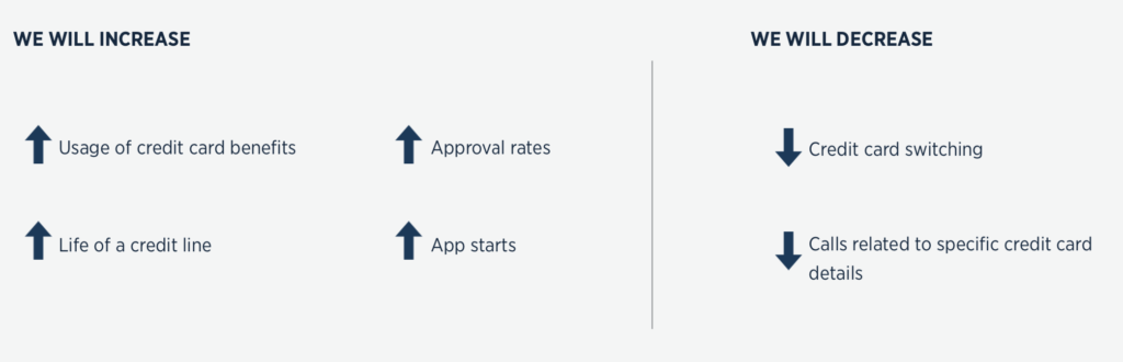
I kicked off the project by conducting interviews with two panels of credit card member service representatives to identify the biggest pain points of members and prospects when it came to credit card acquisition. I then conducted further discovery through user research to validate and better define these problems. Through internal customer experience data, competitive analysis, card sorts, surveys and other user testing results, I prioritized specific problems to focus the content strategy for these pages and align with the product team on quantifiable measures of success for these pages.
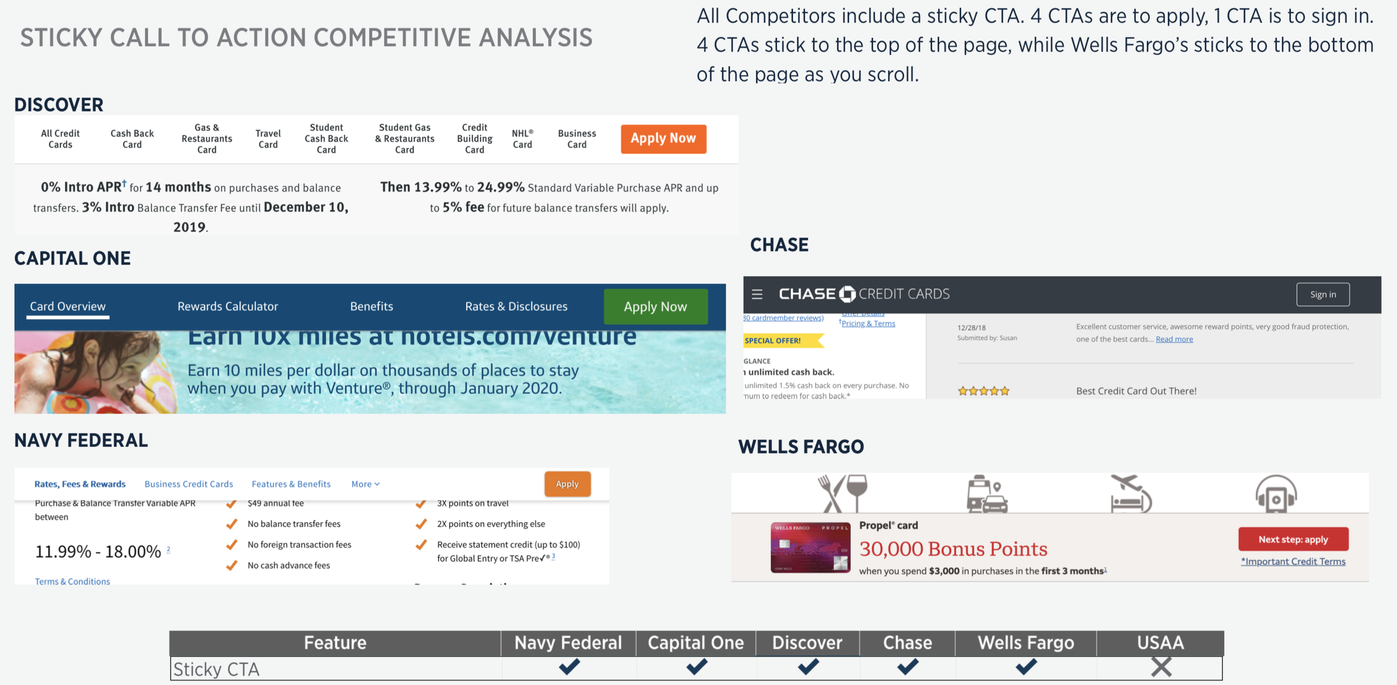
Competitive analysis helped me to discover significant differences between the baseline design and what we saw showing up consistently on competitor sites. One important feature I identified using this method was a persistent, or “sticky” call to action button.
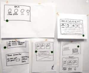
Once I aligned all stakeholders on the key problems we would solve with the new design, I conducted several brainstorming sessions with several designers on various ways that solutions to these problems could be approached.
Weighing against requirements and limitations while incorporating feedback from design reviews, I moved the designs forward by creating several low fidelity wireframes with the most viable content and components coming out of the ideation phase of the design process. A challenge that came with multiple designers tacking different aspects of the credit card experience was a lack of visual consistency across low fidelity mock-ups. To remedy this, I developed a kit of wireframe elements for all designers to use so that the focus would be on the differences between various concepts rather than the visual treatment of components.
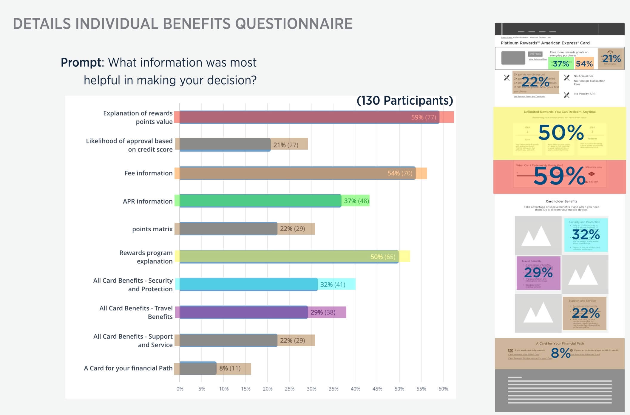
Collaborating with a content manager brought up several questions which didn’t have answers. I wanted to find out which benefits were most important to users in making an important buying decision as well as how users naturally thought about credit card benefits and features. I created several survey tests to answer these questions so that credit card content could be could be presented with a visual hierarchy based on importance to the user. I also created a card sort test to discover how users collectively categorized the benefits that were important so that they’d be easy to identify.
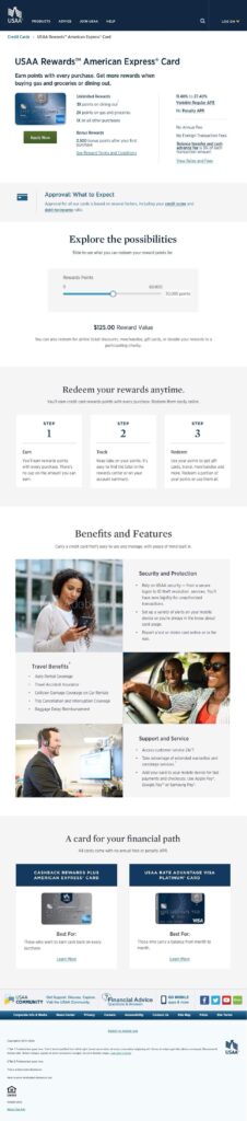
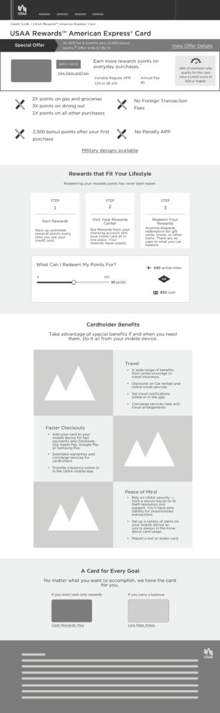
Validating design decisions early on through the UserZoom platform allowed me to move forward into high fidelity with confidence that the new components and arrangement of elements on the page would be helpful for users. You can see in the image to the left that the most helpful component was the rewards points slider, a new tool I designed for to be included on the rewards points card pages.
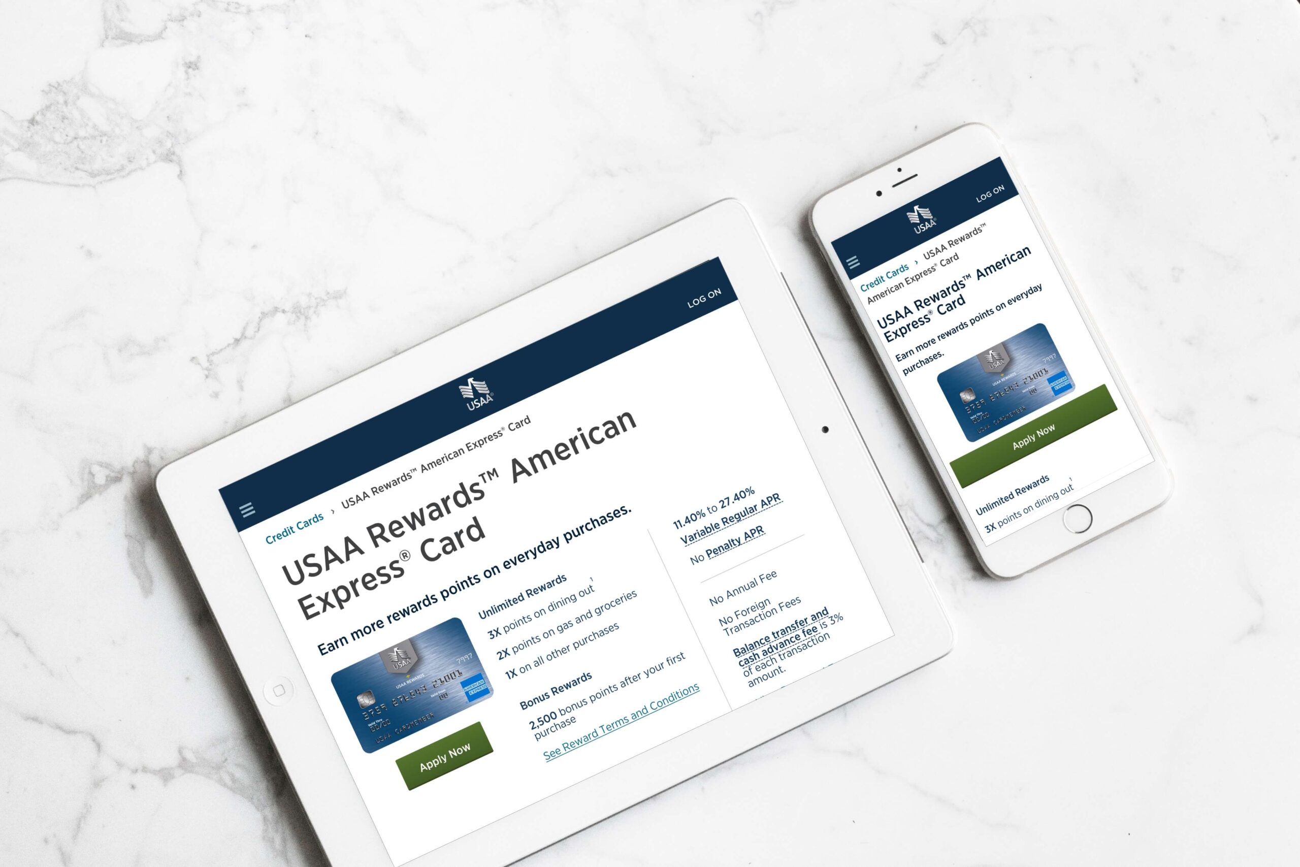
As I moved the design into high fidelity, content was variated to speak specifically to card type (rewards, redemption methods) to highlight the differences between cards as well as to increase SEO value. A result of introducing these helpful non-branded keywords was that “Credit Cards” has gone from 30th position to 16th position as of December 2020. These pages were also used to help Member Service Representatives simultaneously use the same interface that prospects and members were using while assisting them for clearer communication over the phone.