USAA Credit Card Hub
I redesigned the credit card hub (main page) to lay the groundwork to include special offers on credit cards in the future- an important compliance effort. I knew I also wanted to solve for the existing problems within the credit card shopping experience, such as lack of card category guidance as well as redundant information on all credit cards. Implementing components from the USAA design language system allowed the visual and interactive elements of the experience to become more consistent with other bank pages. Though there were many firm legal requirements for the project, I was able to create a more streamlined information hierarchy that better addressed member needs. While iterating on several elements of the page independently, I was able to validate design decisions through a variety of human centered design activities. As a result, the application start rates increased by 15% (2 week average pre launch avg. vs. 2 week post: App start rate for CC main mobile increased from 26% to 30% – a 15% improvement. Source: Adobe Analytics).
It’s good to know that the likelihood of being approved is high before I apply and approve a credit score inquiry.
UserZoom User Testing Platform ParticipantDESIGN PROCESS
I kicked off the project by identifying existing pain points in the experience. The credit card hub had an entirely different functionality for navigating the selection of cards on desktop than on mobile. It didn’t provide guidance or allow users to view all cards available at once, and left out many important details for members and prospects attempting to shop for credit cards. I also documented requirements pertaining to UDAAP (Unfair and Deceptive Acts And Practices) which holds all banks to specific standards when it comes to lending and credit. In addition to this, I identified 8 different scenarios to solve for in addition to the baseline “happy path” experience of the page. With synthesized data acquired through recorded user research interview sessions with members as well as existing external research on prospect preferences around credit cards, I held a prioritization workshop highlighting the most important needs to address. As a team, we aligned by overlapping these with mandatory compliance needs and identified key pain points to solve for in the user journey.
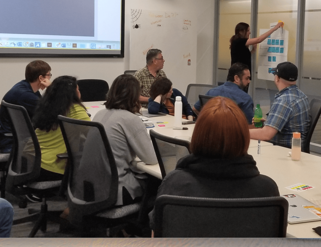
I lead multiple ideation sessions with several other designers to find a variety of ways to design for known scenarios while addressing user needs.
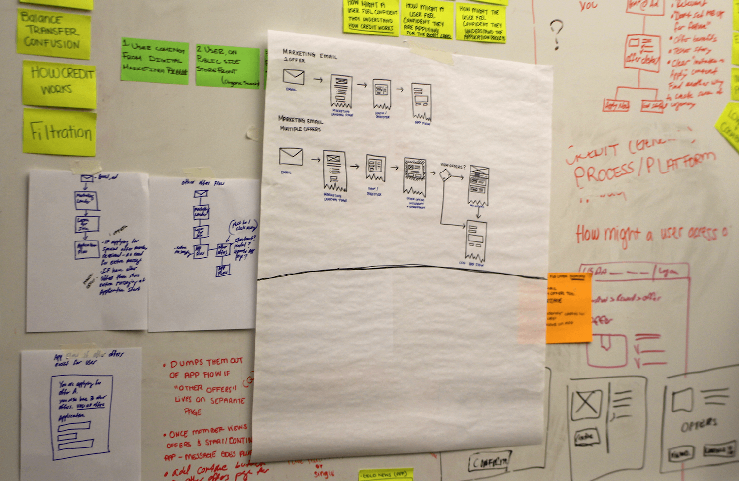
I identified the strongest solutions and applied business and legal requirements to move forward with the most viable concepts. One challenge I had when comparing various low fidelity concepts was keeping track of which components addressed which requirements or user needs. I used a method of documentation that highlighted these design decisions within the wireframes to help keep user needs top of mind while allowing easy comparison of different versions of the page.
I narrowed down the most viable low fidelity concepts through human centered design activities, then evaluated the performance of design output through high fidelity user testing on both desktop and mobile devices.
I continued to iterate on designs based on test results paired with input from key stakeholders. Interestingly, results from four different versions of a multivariate digital optimization test of the banner (top of the page) in production determined that the original version performed better than updated designs. This allowed me to focus on addressing user needs in other parts of the page while moving forward with the current banner with confidence.
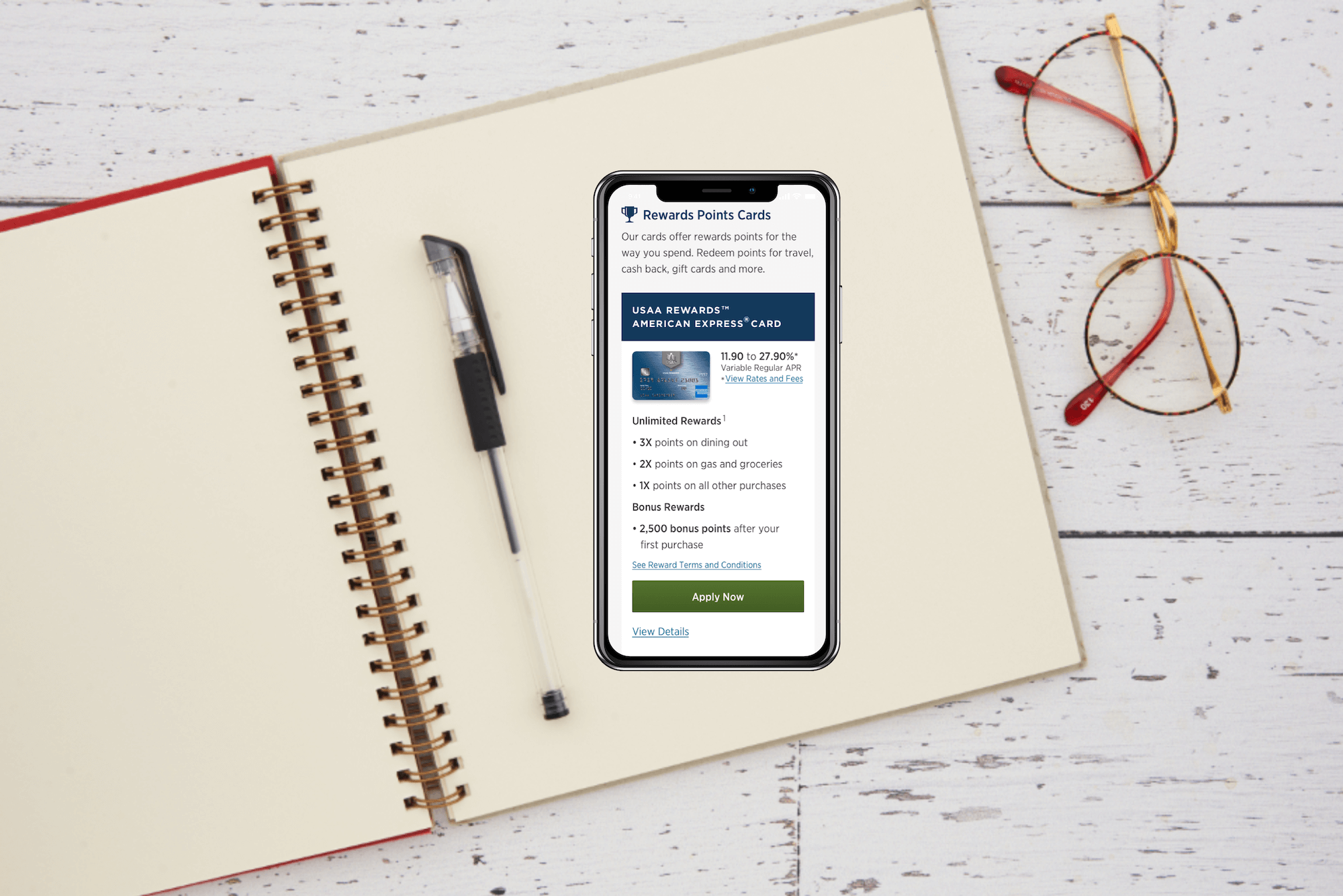
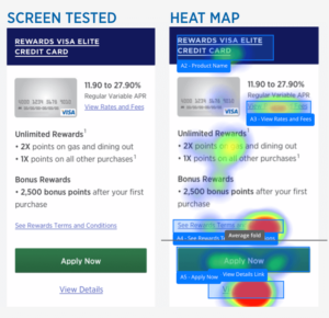
Validating design decisions early on through the UserZoom platform allowed me to move forward into high fidelity knowing that the new components and arrangement of elements on the page would be helpful for users. You can see in the image to the left that the most helpful component was the rewards points slider, a new tool I designed to be included on the rewards points card pages to increase understanding of rewards points value.
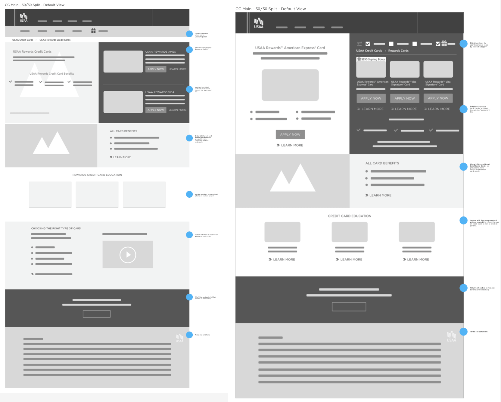
In the launched version of the experience, page navigation parity was established across mobile and desktop. An added section called “Reasons to like these cards” collected common features across cards into one section, reducing cognitive load. Capability to view all cards along with an informative way to display product categories was added to help users find the card that best fit their goals quickly.
