LOAN PRODUCT SELECTION TOOL
This tool was designed to help customers to select which type of home loan would be best for their situation and goals. About half way through the project, priorities changed which required the product should not just be for home loans, but for all types of loans. Changing the established system to one that helped a customer determine which loan type was best out of dozens of options was a much greater challenge for a project that had to fit the same timeline. The retail department presented me with a list of questions that their bankers ask their customers in the branches, but I realized we could create a system that would allow the customer to get to their results as quickly as possible. Through extensive white boarding with our lead developer, we determined an optimized order of asking the questions and a system that would eliminate unnecessary questions; filtering optimal loan types as the customer uses the tool.
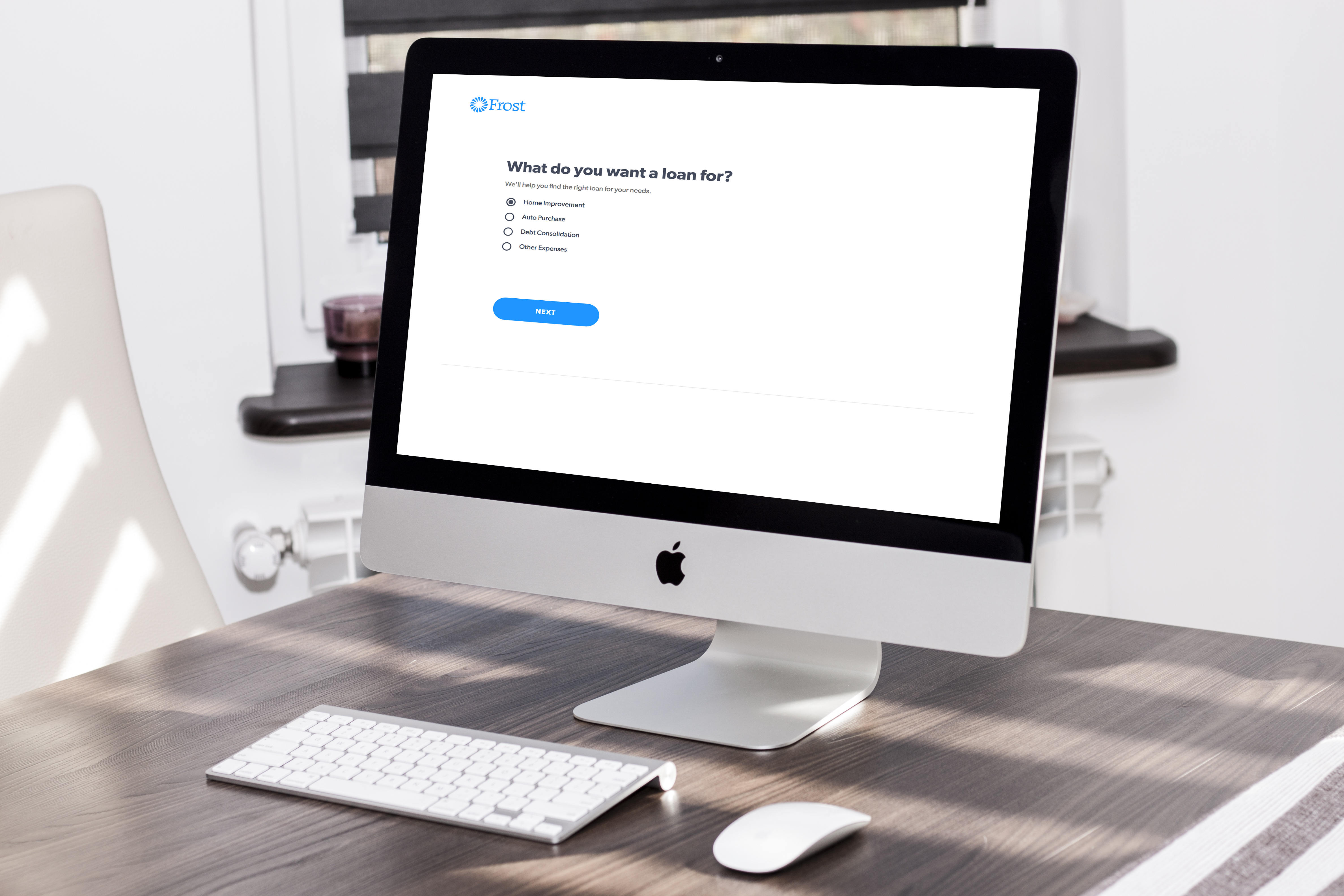
Our bankers used to have to start over every time a customer wanted to make a change. Now they don’t have to.
Raquel Cardenas, Consumer Banking Admin, Frost BankDESIGN PROCESS
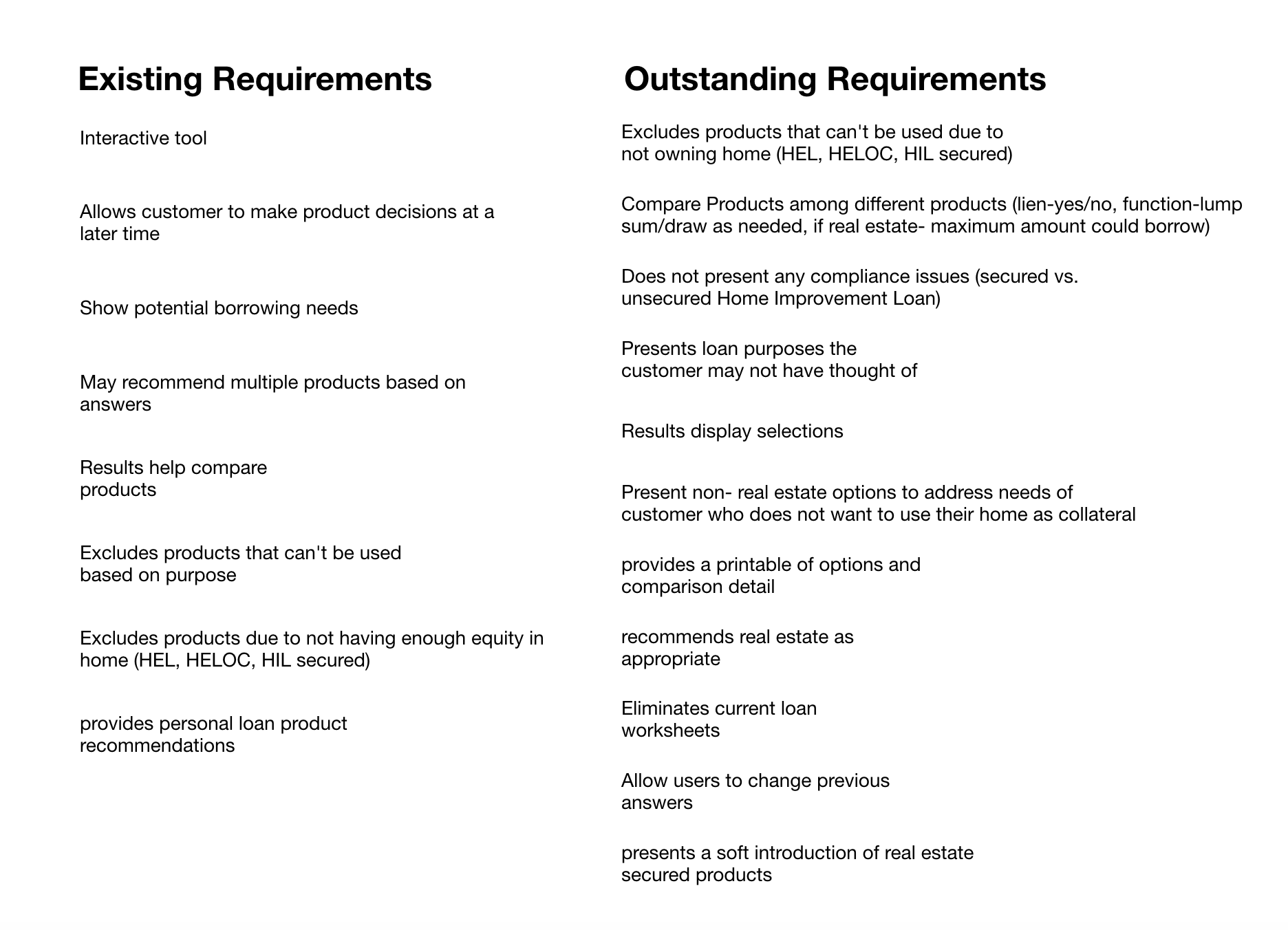
I started with a large body of research and over a dozen business goals to distill it down to one goal- to significantly increase quality loans of all sizes in the communities we serve through companywide collaboration. Through talking with stakeholders, I was able to gather all outstanding requirements for the project.
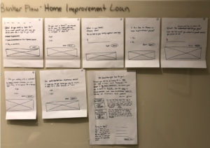
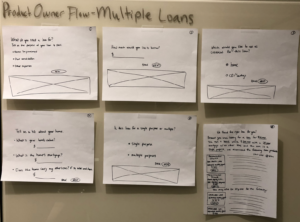
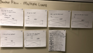
I created hand drawn wireframes that illustrated the interface of three different possibilities. This allowed me to identify gaps and inefficiencies in different paths proposed. The resulting product was a combination of approaches.
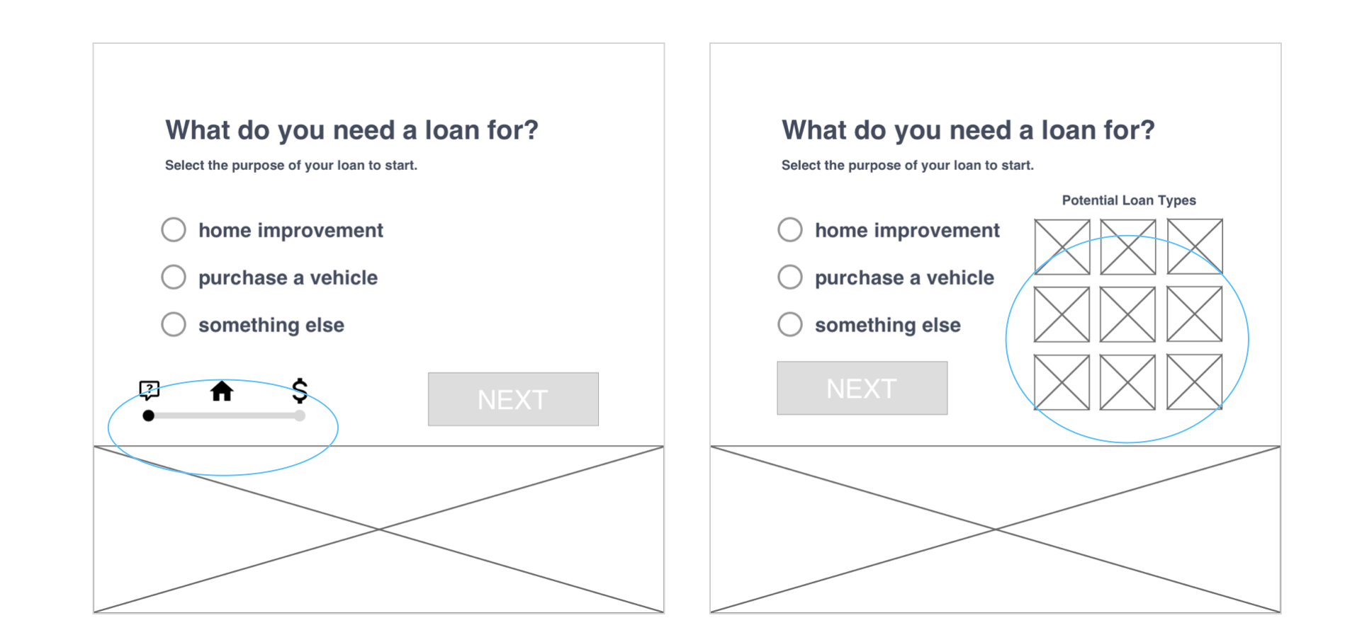
In creating lo fidelity prototypes for iterative testing, I was able to identify further gaps and takeaways:
- Both options communicated progress toward a loan recommendation
- Several copy issues were found
- We might want to consider eliminating the next button for radio selections
- We need to add an option for “does not apply”
- Users prefer “next” button closer to the radio selections
- Users were equally divided on progress indicator preference
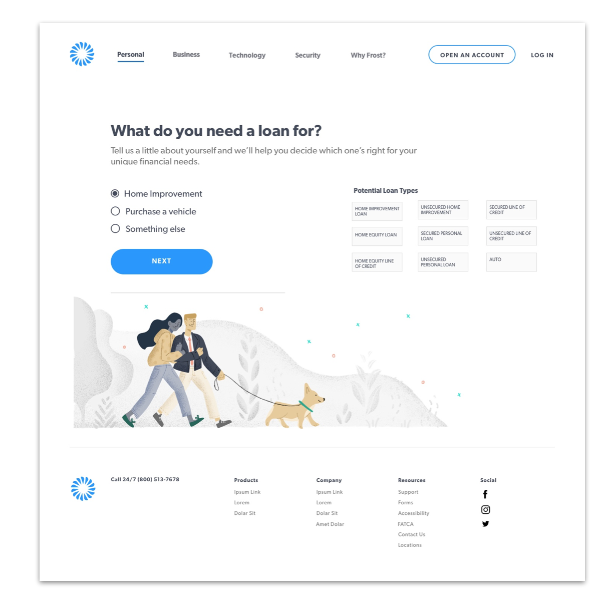
Based on the feedback from both user testing and stakeholders, we decided to move forward with the filtering feature. I also applied the new Aurora Design Language System to the design (Illustration by Kevin Domingo)
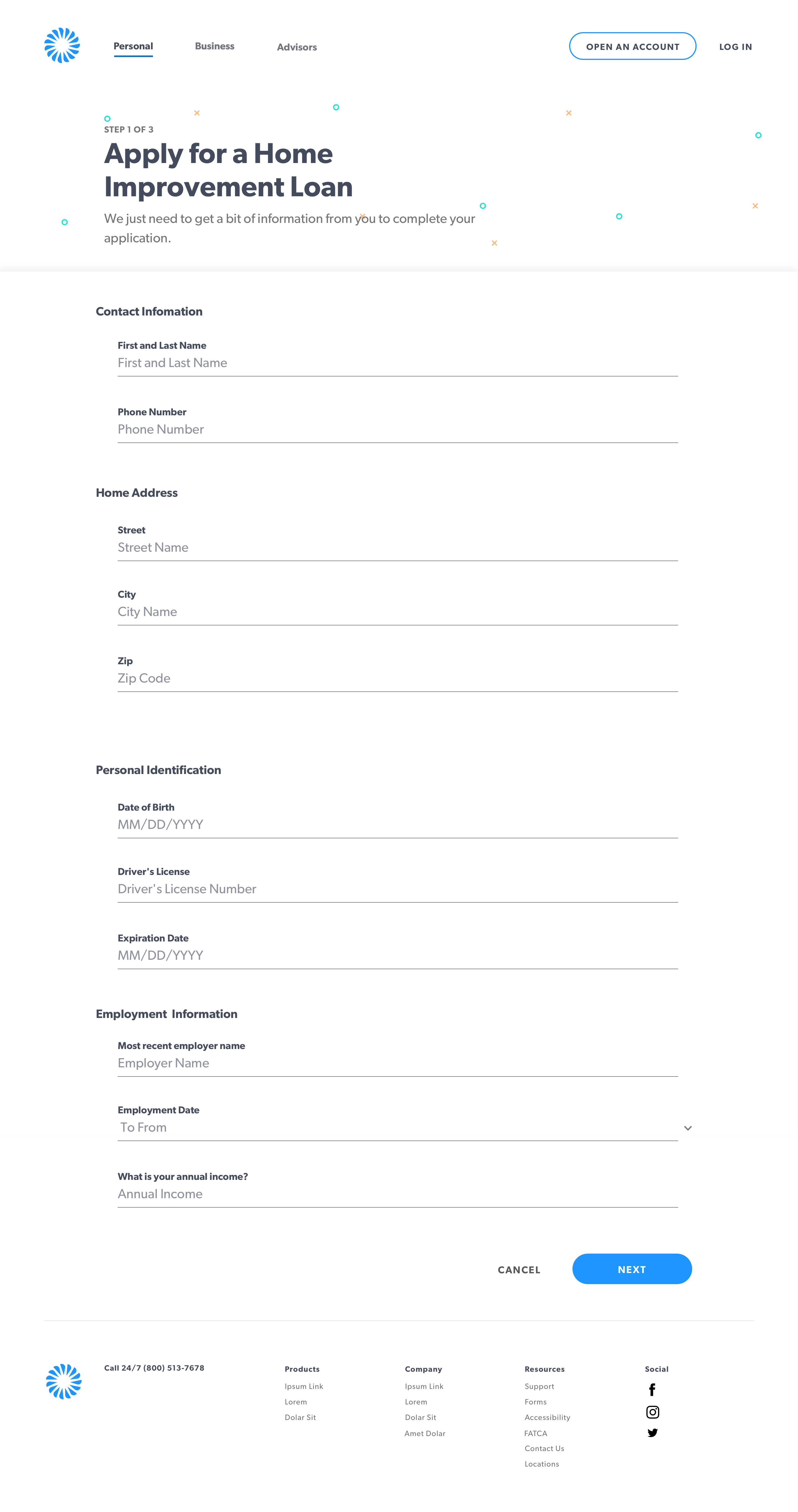
In the future, we will add the options to fill out a follow up form or complete the loan application portion to the digital experience.
The tool ended up being launched as a stripped-down web app for bankers in branches to use when helping customers determine what loan types fit their needs. The results page is designed so the banker can provide customers with a their results printed so that they can bring their options home to discuss with their significant others and follow up with their banker at a later date.