Internal Sales Tool
I lead the research effort and designed native mobile application screens to enable sales professionals of a Fortune 10 company to make data informed pricing decisions using an integrated tool – resulting in greater confidence in conversations with customers and higher margins. After identifying existing pain points, iterative moderated testing with participants with distinct roles informed the way upcoming features were designed. Though the project had a lot of technical complexity, I was able to identify pain points within the experience that could be addressed to make task completion more intuitive and efficient. By planning, conducting and sharing results of evaluative testing efforts as separate work streams, I integrated user research to coordinate with agile development sprints. As a result, the integrated tool decreased potential for error, facilitated faster turnaround, and increased employee and customer satisfaction.
.
Role
Senior Researcher and Designer
Platform
Desktop and native mobile application
Date
July – December 2022

This is 10 times better than (the current platform) already.
User testing participantDESIGN PROCESS
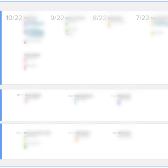
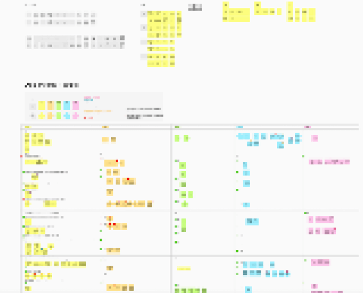
To start, I identified the most significant problems with the existing platforms and tools used across several user segments in various global regions. Part of the challenge was understanding the business and technical rules that existed beyond what was being built to serve the front line employees and their managers to understand what was technically feasible and within project scope. I discovered many disparities between various platforms in use. There were also many processes that could not be completed digitally, and phone calls and hallway conversations were common ways to solve rampant technical issues. These baseline problems helped me to shape the goals for user testing the new system. In addition to this, I identified how the business goals for the new platform could also improve the employee experience. I created reusable templates to enable greater efficiency in user research planning, documentation and outcomes. I maintained a research repository of all research planned and conducted to help visualize the work that has been completed and future research. This repo also surfaces UX recommendations and status of the recommendations made to facilitate prioritization and implementation.

I evaluated the usability of six software features across four user groups through user research and data analysis. These rounds of research included creating prototypes in Figma, gathering and synthesizing data, reporting results and recommending and prioritizing solutions in Mural.


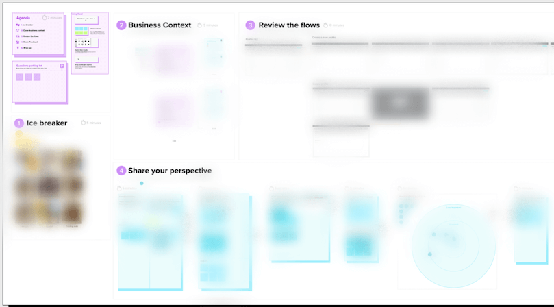
I identified the most significant user problems with the design and provided user experience recommendations to improve the usabilty of the application. One challenge I had when planning usability tests was scheduling participants from user segments that had no room on their calendars. For this user group I conducted a half-hour focus group workshop using Mural, and utilized the privacy mode to avoid group think bias.
When a usability test revealed that a new feature presented an overwhelming amount of information, we wanted to identify what pieces of information were most important. To do so, I planned a survey to gather quantitative data across all sales professionals globally. This resulted in an interface that was easier to digest and more helpful to users.

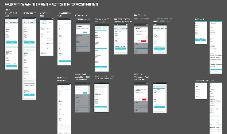
I worked with a designer on the client side as well as a designer on the consultancy side to communicate recommendations to the technical team and lead prioritization discussions to incorporate usability improvements into the backlog of work. I also created interface designs for the native mobile version of the application that aligned to established design styles and interaction patterns for a particular user segment that had pressing response time and location agnostic requirements.
Outcomes from research provided value to the team in the form of learnings. For example, we learned that users were confused by the absence of communication of system status for submitted items, which caused failure to distinguish between the ‘in progress’ and submitted items. I advised and implemented testing plans that allowed us to qualitatively measure the new design. Sometimes I found ways the new design was an improvement to the current experience, and other times we identified ways in which it wasn’t (for example, failing to include needed features, or needing additional information or context for unfamiliar terminology). I then facilitated sessions to prioritize design recommendations based on impact and effort. Recommendations that were not implemented during upcoming sprints were maintained in a backlog for future sprints after initial product launch, along with context, rationale, and risk of not implementing.